Elevating Shazam:
How we enhanced the community feature
March 2024 Leili K.

The Craft of Making it Better

Meet Alex
Alex is always on the hunt for her next favorite song. When a track catches her attention, Shazam helps her discover what’s playing—but her experience doesn’t end there.
She wants to talk about the music she discovers, hear what other fans think, and connect with people who share her taste. Today, that means leaving Shazam and turning to platforms like Reddit to find those conversations.
What if that community already existed inside Shazam?

Ideal User Flow
he user flow was designed around Alex’s need to turn music discovery into connection. Instead of ending the experience once a song is identified, the flow creates a natural path from discovering a song → exploring its community → sharing thoughts → engaging with other listeners.By integrating these interactions directly into Shazam, Alex no longer needs to leave the app and move to platforms like Reddit to discuss the music she discovers. The experience supports her desire for community, personalized interaction, and connection with like-minded music fans, while keeping music discovery at the center of the journey.
Usability Testing
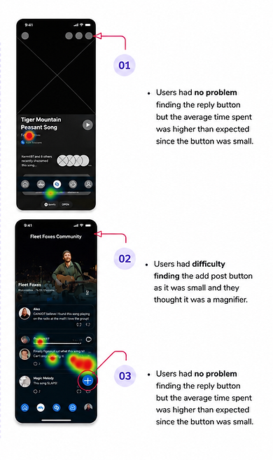
To understand how easily users could move from discovering music to joining the conversation, we tested the prototype with five participants and followed them through three key tasks. Users were able to navigate the experience and understood how to engage with the community, but the testing revealed moments of friction. While participants could find the reply button, its small size caused them to hesitate and increased the time needed to complete the task. The biggest challenge appeared when users tried to create a new post: several participants overlooked the add-post button or mistook the icon for a magnifying glass. These observations showed us that the overall experience was intuitive, but the actions that drive community engagement needed stronger visual hierarchy. Based on these insights, we refined the interface by making key actions larger, clearer, and easier to recognize, helping users move more naturally from discovering a song to becoming part of the conversation.
Sweating the Details
